UNDERSTANDING
The eyes eat first. If the presentation of a post, article, or broadcast publication is not aesthetically pleasing, viewers will lose interest and the exact purpose of journalism — effective communication — will be lost with it.
With this in mind, I make it a priority to understand the elements of purposeful design. In a blend of psychological and artistic comprehension, I have learned what design, dominance, contrast, eye flow, balance, alignment, and unity are. Allow me to delineate:
DESIGN
Design refers to the combination of artistic features such as dominance, contrast, eye flow, balance, alignment, and unity which collectively develop a cohesive and aesthetic layout. This further encourages readers/viewers to explore your work as the visual elements are enticing.
DOMINANCE
Dominance refers to an element of a layout that gains the most attention: it stands out from the rest of the page and hence the name, dominates the design and the attention span of the observer.
CONTRAST
Contrast refers to when opposing, clashing elements are used together. Contrast can refer to color, images, shapes, etc. Even though the contrasting aspects of a design can be complete opposites, it is still possible to be harmonious and aesthetic together. Contrast is intriguing and cajoling to viewers which is why it is super important to incorporate them in print and online design.
EYE FLOW
Eye flow references the natural movement of the eye as it processes the images and information it interacts with. When designing, it is critical to position text, images, and columns in a way which allows the eye flow to absorb material in the correct order while maintaining viewer interest.
BALANCE
Balance is the appropriate distribution of visual elements. Each element such as color, shape, texture, etc. holds a visual weight and balance is the concept of organizing those pieces so that it develops a coherent structure.
ALIGNMENT
Somewhat similiar to balance, alignment refers to the proper assignment of an element to its position on a design while considering borders, edges, and margins. This is critical to consider in print so that text and media are not cropped out.
UNITY
Unity is oneness. Unity is the total and complete harmony of all the elements listed above to, despite their differences, combine into a comprehensible, cohesive, and organized final product.


IMPLEMENTING
With that knowledge in mind, the next step is actually incorporating and considering those concepts as I create and use my designs.
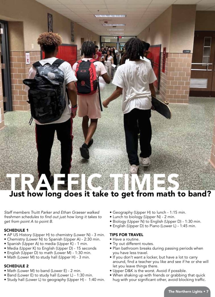
Checkout how we implemented these elements into one of our print publications:
As far as social media goes, I focus on the design and editing of my Instagram Reels segment titled “Keepin’ It Reel.”

The intro of my reels contains design in various forms. The Instagram logo in the middle and large text serve as the dominant feature which occupy the viewer’s attention. The contrast here is the juxtaposing background color (which is consistent with all other publications on our sites and platforms) contrasting with the Instagram logo colors. There is also a factor of alignment as the heading is centered vertically and horizontally on the screen.
The next few frames in my reel are a description of what the following video is to be about. It unifies the video as a whole as it connects the video to the topic it is revolved around. This section also displays an understanding of dominance, as since it is the only text on the screen, viewers are almost forced to read it which avoids any confusion as they continue to watch the reel.


The videos themselves are framed/aligned in a manner which consider borders and edges. There is an eye flow aspect to the closed captioning as the letters appear across the screen from left to right as the viewer reads the text. The image to text ration is balanced and the lower-third also provides unity as it corresponds to the media shown.
The transitions promote eye flow as they follow a satisfying movement to maintain the viewer’s attention.
Each reel contains and effectively uses dominance, contrast, eye flow, balance, alignment, and unity through my understanding of human interest and preference in aesthetics as well as my maximization of using my natural instincts of what is the most harmonious design.


